

Showing posts with label tutorial. Show all posts
Showing posts with label tutorial. Show all posts
Tuesday, March 11, 2014
Tutorial : Bleeding A Photo Outside Of A Frame
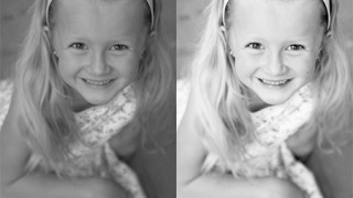
Wondering how to bleed a photo outside of a frame like this bottom example? Check out this tutorial : Bleeding A Photo Outside Of A Frame. Fantastic technique!
Friday, May 17, 2013
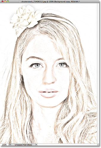
Tutorial : From Photo to Sketch
Gloria, one of my best digi scrap buddy, shared this tutorial on how to make a sketch from a photo here. I'm definitely gonna give it a try soon...

Before :

After
Monday, December 31, 2012
December Challenge : ZARA
SSD Portfolio Challenge - February #40. Washi tape is all the rage right now. Use this tutorial by Peppermint Granberg to feature realistic digital washi tape on your page. -2pts. Credits : Framestatic by Juliana Kneipp
Washi tape and Border : A Happy Family by Erica Zane
Attitude of Gratitude - Paper Pack by Connie Prince

Washi tape and Border : A Happy Family by Erica Zane
Attitude of Gratitude - Paper Pack by Connie Prince
Sunday, December 9, 2012


Tuesday, October 23, 2012
Tutorial : Watercolor Effect
Lately I'm in the mood f tryng some new techniques to experiment artsy layout. I've been browsing Anna Aspnes's gallery at Oscrap and I found this super artsy tutorials that I would like to try sometime. Care to join me?


Wednesday, September 26, 2012
Extraction Tutorial
I found a really good extraction tutorial at Scrapbookgraphic. It is really details and shows how to extract the most gruesome part : THE HAIR. Check it out here!


Before
After
There is one more tutorial about brush here that you might find useful too!
Thursday, August 30, 2012
Tutorial : How to turn PHOTOS into PAINTINGS
Wow...it's super fast and easy :). The steps are :

- Duplicate the photo layer (Ctrl J).
- Desaturate it to turn it into black and white (Ctr Shift U) & duplicate it again (Ctrl J).
- Invert the upper layer (Ctrl I) and chang the blending mode into COLOR DODGE.
- Go to FILTER > BLUR > GAUSSIAN BLUR and set the RADIUS.
- Double click the BG layer to free it and move it to the top.
- Change the blending mode into LINEAR BURN and set the FILL into 90%.
- You can use BURN tool too part of the photo you want to darken.

Tuesday, July 17, 2012
Watercolor Tutorial
From this :
To this :

Check out the tutorial here!
This tutorial is with Photoshop CS4, using Filter > Stylize > Find Edges.
Type Ctrl + Alt + U and change the Saturation to -100
and.... just continue reading from the tutorial link :).
Oh yeah, you will need to download the water paint brush in Stephanie Shimerdla Brushes.
This tutorial is with Photoshop CS4, using Filter > Stylize > Find Edges.
Type Ctrl + Alt + U and change the Saturation to -100
and.... just continue reading from the tutorial link :).
Oh yeah, you will need to download the water paint brush in Stephanie Shimerdla Brushes.
Sunday, April 29, 2012
Photoshop Tutorial : Better BLACK & WHITE, Lighten Shadowed Photo Portion and Free ACTION

Saturday, April 21, 2012
Photoshop Tutorial : Scalloped Border, Curvy Border, Text on a Path, Text Shapes

I also found some Video Tutorials on You Tube if you are the kinda person that followed direction better in video than reading (just like me!). All of these videos are created by Kelly Jo and for that I thank her very much...
Scalloped Border Video Tutorial
Curvy Border Video Tutorial
Text on a Path Video Tutorial
Text Shapes Video Tutorial
Thursday, January 19, 2012
Same Photos + Different Styles and Techniques = Countless Layouts
Seperti FILM yang punya banyak genre : drama, action, horror, komedi, atau MUSIK yang bisa digolongkan menjadi pop, rock, jaz, dangdut, Digital Scrapbooking juga ada style-nya, lho! Di sini akan dibahas beberapa style layout yang bisa jadi panduan kamu untuk menemukan style kamu dalam berkarya. Here we go....
Dari 6 foto di samping ini, aku akan mencoba memperkenalkan jenis style digital scrapbooking dan teknik-tekniknya. Aku hanya ingin menunjukkan bahwa dengan jenis style yang berbeda + kombinasi teknik + imajinasi = beragam jenis layout!
Menurut Debbie Hodge, layout yang baik selalu mengandung 5 struktur dasar berikut ini : photo, title, journaling, embelishment & canvas (paper). Tapi, kita juga harus menerapkan elemen desain seperti : Emphasis (Dominance), Repetition, Alignment, Contrast, Balance, Flow agar layout kita tidak "menganiaya mata"... hahaha... Contohnya seperti di samping ini.
 Semua struktur memang sudah terpenuhi, tapi elemen desain tidak diperhatikan. Emphasis/fokus-nya nggak jelas, semua foto berkompetisi menarik perhatian sehingga membingungkan. Repetion (pengulangan) elemen burung kuning kurang variatif sehingga membosankan. Alignment (margin) nggak jelas, rata kanan atau kiri atau tengah. Contrast, bingung kebanyakan warna. Balance, sama sekali nggak seimbang antara bagian kanan dengan kiri layout. Flow, nggak ada panduan sama sekali dari mana harusnya pandangan mata dimulai dan berakhir aliasnya movement-nya ngaco! TERRIBLE....
 OK, jadi perlu diingat bahwa digital scrapbooking bukan sekedar main tempel foto dan elemen lainnya, tapi juga harus mematuhi prinsip-prinsip desain yang 6 tadi : ERACBF. Nah, seterusnya ada beberapa style layout yang bisa kamu pakai eksperimen sebelum mendapatkan style kamu sendiri.
Di bawah ini, dengan kit yang sama yaitu Land of Learning dari Marie H Design, bisa dibuat 3 jenis layout yang sangat berbeda. Lihat deh, hanya dengan satu kit kamu bisa menciptakan beragam jenis tipe layout. So, start maximising the use of your kit by experimenting with it now!
1. CLASSIC
Balance and structure are key points of classic style layouts. - by Jennifer Marione
 Ciri khas style classic adalah letak foto-foto yang tegak, jarang sekali yang miring-miring. Elemen penghiasnya pun cenderung minimalis. Jurnaling menjadi struktur yang penting dalam style jenis classic ini. Layout jenis ini cocok sekali buat digi-scrapper yang senang desain yang simetrikal dan seimbang (balance).
Teknik yang aku pakai dalam pembuatan layout klasik ini pun sederhana. Pertama, aku tumpuk kertas biru yang sudah di-resize di atas kertas kuning dan ditambahkan ric-rac putih sebagai pemanis. Kedua, semua foto di-crop dengan bentuk segiempat yang sama besar lalu diberi bingkai putih melalui menu Image > Stroke. Ketiga, aku buat judul dengan kombinasi 2 font. Keempat, jurnaling diketik dengan alignment rata tengah dan tidak lupa penambahan tanggal. Kelima, penambahan pita, kancing dan bintang untuk menghias layout. Terakhir, tidak lupa ditambahkan shadow untuk memberikan sedikit kesan timbul walaupun tipis sekali.
2. CLEAN
White space and sparse embellishments are the hallmarks of the clean layout style. - by Tricia Groenhoff
 Ciri khas style clean adalah layout yang terkesan simple tanpa banyak elemen penghias. Banyak ruang kosong tercipta, sesuai dengan slogan "Less is More". Kalau kamu tipe orang yang suka dengan gaun sederhana yang simple tanpa pernak-pernik, maka layout ini cocok banget untuk kamu! Layout jenis clean ini bagus sekali untuk scrapping foto-foto yang cantik dan berkualitas baik sehingga sayang kalau harus berkompetisi dengan elemen penghiasnya. Kertas dengan warna cerah maupun bercorak juga bisa digunakan dalam layout jenis ini dengan jumlah terbatas tentu saja.
Teknik yang aku pakai dalam layout clean ini termasuk sederhana. Pertama, aku tumpuk kertas hijau dan bercorak garis yang sudah diperkecil di atas kertas polkadot biru. Kedua, aku lubangi kertas hijaunya agar tembus mengekspos foto dan kertas bercorak di bawahnya. Ketiga, foto-fotonya aku ubah menjadi hitam putih dan diatur menggunakan fungsi Image > Adjustment > Hue Saturation ke arah warna biru supaya serasi dengan warna background. Keempat, jurnaling diketik dan dirotasi ke kiri. Kelima, judul dan tanggal ditambahkan sesuai prinsip allighment rata tengah. Terakhir, simple shadowing diterapkan hanya pada kertas hijau untuk kesan timbul.
3. HODGEPODGE
Mixed patterns and layering are cornerstones of hodgepodge style layouts. - by Kate Earley
 Kalau kamu suka layout yang “eclectic,” style hodgepodge ini udah pasti bakal jadi favorit kamu. Ciri khas style hodgepodge adalah kombinasi foto, kertas dan embellishment yang saling bertumpuk membentuk layout yang penuh tekstur dan meriah. Digi scrapper jenis ini suka mencampur berbagai bentuk, corak dan jenis kertas plus embellishment dan merangkainya di seputar foto yang telah diatur dalam berbagai kemiringan.
Aku menggunakan cukup banyak teknik untuk me-retouch foto-foto yaitu : teknik Out of Bound ( = objek sepeti keluar dari bingkainya) dan Blur background ( = latar belakang foto diburamkan) untuk foto kiri bawah dan teknik Selective colouring (= latar belakang foto dibuat hitam putih tapi image fokusnya tetap berwarna) untuk foto tengah atas. Sedangkan untuk 2 foto lainnya aku hanya bermain dengan Image > Adjustment > Levels dan Brightnest/Contrast untuk memperbaiki kualitas foto yang agak gelap menjadi lebih terang. Teknik re-touch foto sangat penting untuk dipelajari karena foto adalah element paling penting dari sebuah layout, jadi kalau kualitasnya bagus pasti akan menunjang kesempurnaan layout secara keseluruhan. Teknik lain untuk menggelapkan / menerangkan hanya sebagian dari foto adalah menggunakan tool Dodge and Burn.
Selanjutnya, aku menumpuk 3 kertas dengan ukuran dan posisi yang berbeda. Masalahnya kertas background yang aku pakai warna asalhnya kurang gelap, jadi aku atur sedikit meggunakan Image > Adjustment > Levels dan Hue Saturation ke arah biru gelap.Tutorial cara mengubah warna embellishment ada di sini.
Berikutnya, aku mengatur pigura dan fotonya dengan posisi bertumpuk dan miring-miring untuk kesan "messy". Journaling diketik di atas kertas bergaris yang tidak lupa diberi shadow untuk kesan melayang. Embellisment pensil, pita dan bintang-bintang diletakkan terakhir untuk menghias layout. Selesai... eh, jangan lupa shadow-nya ya. Tidak semua elemen mempunyai komposisi shadow yang sama, lho. Untuk tutorial lebih dalam tentang shadow, bisa lihat di sini dan di sini.
4. SHABBY CHIC / VINTAGE
Soft colors and a worn feel are typical in shabby chic style layouts. - by Jennifer Marione
 Jika kamu gemar barang antik dan suka membuat clustering dengan bunga-bunga yang feminin maka layout jenis shabby chic ini cocok sekali untuk kamu. Keseluruhan layout shabby chic akan menampilkan kesan vintage yang anggun.
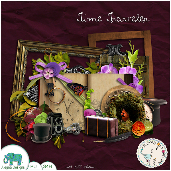
Kali ini aku menggunakan kit yang berbeda, Time Traveler dari Alegna Design karena kit yang pertama tidak cocok dengan kesan shabby chic yang ingin ditampilkan. Kit shabby chick didominasi oleh koleksi kertas yang usang, sebagian besar bernada pastel dan embellishment yang feminin.
 Untuk menampilkan kesan vintage, foto-foto aku ubah menjadi sepia. Lalu aku merangkai aneka embellishment membentuk clustering di sekitar pigura foto. Tips untuk teknik clustering yang baik bisa dilihat di sini. Jurnaling aku letakkan di sisi kanan untuk menyeimbangkan layout secara keseluruha. Teknik menciptakan jurnaling dan title yang cantik bisa dilihat di sini, di sini dan di sini.
Nah, untuk menciptakan latar belakang yang unik, bisa digunakan teknik Blending seperti di atas. Dalam layout ini fungsi blending image adalah untuk mengisi kekosongan bagian kiri atas. Tutorial blending bisa dibaca di sini.
5. FANTASY
Using artistic imagery to tell the story is commonplace in fantasy style layouts. - by Joann Kinnard
 Ciri khas style fantasi adalah background layout seperti di dunia imajinasi. Teknik ekstraksi kerap digunakan untuk memisahkan objek dari latar belakangnya dan menaruhnya di halaman fantasi yang sebelumnya telah diciptakan. Layout jenis ini cocok sekali buat kamu yang sangat kreatif dan suka bereksperimen dengan tema-tema fantasi. Berbeda dengan style lain yang biasanya disertai jurnaling sebagai pengikat memori, maka layout jenis fantasi ini lebih kuat kesan art-nya karena berfokus pada keartistikan image yang ingin ditonjolkan.
 Kit fantasi pun berbeda dari kit style lainnya karena kebanyakan embellishmentnya adalah benda real sesuai tema layout yang hendak dibuat. Kit untuk kreasi kali ini adalah Goat dari Galerie de Jackie. Teknik ekstraksi yang dipakai di sini bisa dilihat di sini dan teknik shadow 3 dimensinya bisa dilihat di sini.
Nah, style mana yang paling kamu suka? Pilih dan ceritakan alasan kamu lewat komentar di bawah posting artikel ini ya. Awas kalo nggak... hehehe. Happy experimenting!
Note : Yang mau lebih serius belajar digi-scrap, bisa lihat ke Get It Scrapped.
1. Lesson #1: Learn Scrapbooking Design Principles
2. Lesson #2: Emphasis
3. Lesson #3: Repetitions
4. Lesson #4: Alignment
5. Lesson #5: Contrast
6. Lesson #6: Balance
7. Lesson #7: Visual Flow
8. Lesson #8: Page Part

Dari 6 foto di samping ini, aku akan mencoba memperkenalkan jenis style digital scrapbooking dan teknik-tekniknya. Aku hanya ingin menunjukkan bahwa dengan jenis style yang berbeda + kombinasi teknik + imajinasi = beragam jenis layout!
Menurut Debbie Hodge, layout yang baik selalu mengandung 5 struktur dasar berikut ini : photo, title, journaling, embelishment & canvas (paper). Tapi, kita juga harus menerapkan elemen desain seperti : Emphasis (Dominance), Repetition, Alignment, Contrast, Balance, Flow agar layout kita tidak "menganiaya mata"... hahaha... Contohnya seperti di samping ini.


Di bawah ini, dengan kit yang sama yaitu Land of Learning dari Marie H Design, bisa dibuat 3 jenis layout yang sangat berbeda. Lihat deh, hanya dengan satu kit kamu bisa menciptakan beragam jenis tipe layout. So, start maximising the use of your kit by experimenting with it now!
1. CLASSIC
Balance and structure are key points of classic style layouts. - by Jennifer Marione

Teknik yang aku pakai dalam pembuatan layout klasik ini pun sederhana. Pertama, aku tumpuk kertas biru yang sudah di-resize di atas kertas kuning dan ditambahkan ric-rac putih sebagai pemanis. Kedua, semua foto di-crop dengan bentuk segiempat yang sama besar lalu diberi bingkai putih melalui menu Image > Stroke. Ketiga, aku buat judul dengan kombinasi 2 font. Keempat, jurnaling diketik dengan alignment rata tengah dan tidak lupa penambahan tanggal. Kelima, penambahan pita, kancing dan bintang untuk menghias layout. Terakhir, tidak lupa ditambahkan shadow untuk memberikan sedikit kesan timbul walaupun tipis sekali.
2. CLEAN
White space and sparse embellishments are the hallmarks of the clean layout style. - by Tricia Groenhoff

Teknik yang aku pakai dalam layout clean ini termasuk sederhana. Pertama, aku tumpuk kertas hijau dan bercorak garis yang sudah diperkecil di atas kertas polkadot biru. Kedua, aku lubangi kertas hijaunya agar tembus mengekspos foto dan kertas bercorak di bawahnya. Ketiga, foto-fotonya aku ubah menjadi hitam putih dan diatur menggunakan fungsi Image > Adjustment > Hue Saturation ke arah warna biru supaya serasi dengan warna background. Keempat, jurnaling diketik dan dirotasi ke kiri. Kelima, judul dan tanggal ditambahkan sesuai prinsip allighment rata tengah. Terakhir, simple shadowing diterapkan hanya pada kertas hijau untuk kesan timbul.
3. HODGEPODGE
Mixed patterns and layering are cornerstones of hodgepodge style layouts. - by Kate Earley

Aku menggunakan cukup banyak teknik untuk me-retouch foto-foto yaitu : teknik Out of Bound ( = objek sepeti keluar dari bingkainya) dan Blur background ( = latar belakang foto diburamkan) untuk foto kiri bawah dan teknik Selective colouring (= latar belakang foto dibuat hitam putih tapi image fokusnya tetap berwarna) untuk foto tengah atas. Sedangkan untuk 2 foto lainnya aku hanya bermain dengan Image > Adjustment > Levels dan Brightnest/Contrast untuk memperbaiki kualitas foto yang agak gelap menjadi lebih terang. Teknik re-touch foto sangat penting untuk dipelajari karena foto adalah element paling penting dari sebuah layout, jadi kalau kualitasnya bagus pasti akan menunjang kesempurnaan layout secara keseluruhan. Teknik lain untuk menggelapkan / menerangkan hanya sebagian dari foto adalah menggunakan tool Dodge and Burn.
Selanjutnya, aku menumpuk 3 kertas dengan ukuran dan posisi yang berbeda. Masalahnya kertas background yang aku pakai warna asalhnya kurang gelap, jadi aku atur sedikit meggunakan Image > Adjustment > Levels dan Hue Saturation ke arah biru gelap.Tutorial cara mengubah warna embellishment ada di sini.
Berikutnya, aku mengatur pigura dan fotonya dengan posisi bertumpuk dan miring-miring untuk kesan "messy". Journaling diketik di atas kertas bergaris yang tidak lupa diberi shadow untuk kesan melayang. Embellisment pensil, pita dan bintang-bintang diletakkan terakhir untuk menghias layout. Selesai... eh, jangan lupa shadow-nya ya. Tidak semua elemen mempunyai komposisi shadow yang sama, lho. Untuk tutorial lebih dalam tentang shadow, bisa lihat di sini dan di sini.
4. SHABBY CHIC / VINTAGE
Soft colors and a worn feel are typical in shabby chic style layouts. - by Jennifer Marione

Kali ini aku menggunakan kit yang berbeda, Time Traveler dari Alegna Design karena kit yang pertama tidak cocok dengan kesan shabby chic yang ingin ditampilkan. Kit shabby chick didominasi oleh koleksi kertas yang usang, sebagian besar bernada pastel dan embellishment yang feminin.
Nah, untuk menciptakan latar belakang yang unik, bisa digunakan teknik Blending seperti di atas. Dalam layout ini fungsi blending image adalah untuk mengisi kekosongan bagian kiri atas. Tutorial blending bisa dibaca di sini.
5. FANTASY
Using artistic imagery to tell the story is commonplace in fantasy style layouts. - by Joann Kinnard


Nah, style mana yang paling kamu suka? Pilih dan ceritakan alasan kamu lewat komentar di bawah posting artikel ini ya. Awas kalo nggak... hehehe. Happy experimenting!
Note : Yang mau lebih serius belajar digi-scrap, bisa lihat ke Get It Scrapped.
1. Lesson #1: Learn Scrapbooking Design Principles
2. Lesson #2: Emphasis
3. Lesson #3: Repetitions
4. Lesson #4: Alignment
5. Lesson #5: Contrast
6. Lesson #6: Balance
7. Lesson #7: Visual Flow
8. Lesson #8: Page Part
Monday, January 9, 2012
Photoshop Tutorial : Page Curl
My friend, Chika, asked me if I knew a good tutorial for making a page curl. I've never done it before... So, I searched and found this short but useful tutorial :
Friday, December 30, 2011
Digital Scrapbooking Manual
The FREE Digital Scrapbooking Manual is a resource filled with information we wished we would have known when we started digital scrapbooking. We asked digital scrapbookers and designers from around the community what they wished they would have known in the beginning and we share that information with you; expanding on it to save you from making the same mistakes we did. What would our team members do over? What do Ali Edwards, CD Muckosky, Peppermint Granberg (One Little Bird), Katrina Kennedy, Kayla Lamoreaux, Debbie Hodge, Krista Sahlin, Jenn Barrette, SuzyQScraps, (and more) wish they would have known in the beginning? Come find out! The Digital Scrapbooking Manual is a free gift brought to you by The Daily Digi.
It cover all Digi Scrap topics such as :
1. What is Digital Scrapbooking?
2. Freebies
3. Downloading and Unzipping
4. Backing Up
5. Shopping
6. Organizing
7. How to start scrapping
Looking back, I really should have read this first before I began digi scrap 4 months ago... lol :) I especially like the last part of this manual titled "What I wish I knew from the start", that contains designers and digi scrappers list of wishes in the past. Well, better late than never....
Tuesday, December 13, 2011
Photoshop Tutorial : Quick & Clean Recoloring
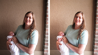
Today, I learned a super quick trick to recolor word art or elements here. It really saves time and amount of layers in Photoshop. Once again thank you, Peppermint! I turned this :


into this :

Piece of cake.....
Sunday, December 11, 2011
Photoshop Tutorial : Dreamy Innocent Girl Look

I tried to PM saskia and asked her, but she hasn't answered back. So, I turned to the only person, whose tutorials are very precious to me, Rachel aka Harmonystar.
And amazingly, only after a few hours after I sent the email she has written back to me. She said :
I'm so pleased that you asked. I actually think that for the example above a filter or professional made action may have been used, but lets see if I can get you close to your desired effect without spending money.
On my Face It tutorial here: http://forums.gingerscraps.net/showt...p?7521-Face-It I did go over some eye enhancements to make eyes more blue, you use the curves and raise the blue curve. I've continued to learn a lot since doing this tutorial and instead of using the unsharp mask on the eyes I now use Filter - Other - High Pass Just on the eyes. It's a little more natural but very similar.
Anyhow, onto the skin. I don't know how familiar you are with photoshop but you can duplicate the picture, then use filter-blur-gaussian blur this will make your whole photo blurry so next you want to add a mask, paint the whole mask black, then with a soft white brush paint over the skin parts you want smooth, staying away from any details. If the blur is too much you can lower the opacity.
Hope that helps. if the skin thing is confusing to you you can search google for photoshop skin smoothing tutorial and will probably come up with several.
")
Good luck! I love that look!
Wow... Using this trick from Rachel and the last tutirial on changing eyes color, I came up with this :
BEFORE

AFTER

Phew, this is surely the most complicated photo retouch I've ever learned.... I know it's not perfect but at least I know how to get it done :). And then, I used Winter Land kit by Marie H Design which is perfect for this is the layout. I uploaded this layout in Desember Sugar Swap challenge at Ginger Scrap.

Photoshop Tutorial : All about Eyes
Like I said before, I'll try to learn at least 1 tutorial per week to enhance my technique. This time I'm focusing myself on PHOTO EDITING tutorials. I have a confession to make.... I always want to have green eyes. Hahaha... Because I can't get them in real life (unless I buy contact lenses of course :), so why not try to re-touch my photo then! Here are some great tutorials by maxpower285 I found in You Tube :
And these are some comments that I found helpful :
Q : Every tutorial i see is with blue eye... How can I change the color in a dark eye without looking weird?
A : You could always try desaturating the eye and then try it, to do that use the same selection process or even use the pen took to select the eye, and then press ctrl + shift +u to desaturate it, then colour the eye as normal by using the gradient if you want a multi colour eye like in this vid or by using the hue/saturation if you want a one colour eye, to get the hue/saturation up press ctr l+ u , ill send you message on another way coz this message is to long lol
Q : Every tutorial I watch people say "press Q" but nothing ever happens when I press it. What is the alternate command to that??? Thanks!
A : When you press q, it is the short cut key to the quick mask, to use it you need to press the paint brush tool and you can paint red which is the mask and then you press q again and it makes a selection where you have painted the quick mask, hope this helps :o)
Photoshop CS5 Multi Eye Colour Tutorial
And these are some comments that I found helpful :
Q : Every tutorial i see is with blue eye... How can I change the color in a dark eye without looking weird?
A : You could always try desaturating the eye and then try it, to do that use the same selection process or even use the pen took to select the eye, and then press ctrl + shift +u to desaturate it, then colour the eye as normal by using the gradient if you want a multi colour eye like in this vid or by using the hue/saturation if you want a one colour eye, to get the hue/saturation up press ctr l+ u , ill send you message on another way coz this message is to long lol
Q : Every tutorial I watch people say "press Q" but nothing ever happens when I press it. What is the alternate command to that??? Thanks!
A : When you press q, it is the short cut key to the quick mask, to use it you need to press the paint brush tool and you can paint red which is the mask and then you press q again and it makes a selection where you have painted the quick mask, hope this helps :o)
Photoshop CS5 Rainbow Eye Colour Tutorial
Subscribe to:
Posts (Atom)